Around the middle of May, Victor had set up a temporary web page and began noodling on the logo which would influence the rest of the website design. About two weeks went by and he sent me some concepts he had been working on.
In his email explained, “The two circular ones on the left, the only difference is the font, sans serif vs. serif. The one on the right is using a frame/border approach as opposed to a circle. I was using blue and gold as sort of a homage to St. Mary’s.
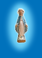
In 1951, Mom and Dad moved to St. Mary’s Parish in Akron, Ohio where the Howe family grew up. St. Mary’s is a beautiful church with a large fresco of the Assumption of Our Blessed Mother overlooking the High Altar.
If you like the frame idea, we can explore that a little further. I just grabbed a brush in Illustrator and thought that pattern looked kind of neat”. There were certain elements I liked about each of these concepts. The circular ones appealed to me more than the frame idea although the frame idea might make an interesting book cover. The little “club” symbol in the frame is remarkably close to an ancient symbol for Mary also known as a Fleur-de-lis.
![]() I agreed that blue and gold was a good color scheme. I marked up some ideas and sent them back to Victor and explained what I was looking for. One thought was to put a sun behind the Madonna, “woman clothed with the sun,” instead of straight sun rays and maybe with a slight curve?
I agreed that blue and gold was a good color scheme. I marked up some ideas and sent them back to Victor and explained what I was looking for. One thought was to put a sun behind the Madonna, “woman clothed with the sun,” instead of straight sun rays and maybe with a slight curve?
I suggested some soft white rays emanating from her hands, “graces and mercy.” Perhaps we should add 12 stars around Mary’s head in a halo? I also asked if it was possible to make it look less like a statue? I really liked the idea of using Mom’s statue but was simply curious what a more artistic Madonna might look like. All in all, what Victor presented was genuinely a nice start.
A few days went by, and Victor emailed me a dozen or so istockphoto and shutterstock examples of artwork of the Blessed Mother to preview. After careful review, I decided upon several elements from three of the examples and asked Victor if he could incorporate them into one image. Below are the images that I choose.
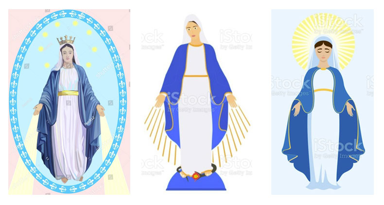
For the image on the left, I said, “I like the image of the Blessed Mother, she has a nice face with eyes that seem to look back at you and I like the rays coming from her hands.”
For the image in the middle, I said, “I like the fact that she is standing on the snake and the earth under her. This goes back to Gen. 3: 15, in some older bibles this passage reads “I will put enmity between you and the woman, between her offspring and yours, she will crush your head, while you strike at His heel.”
For the image on the end, I said, “I like the rays surrounding her head which is a good representation of the “woman clothed with the sun” and it looks like a super luminous halo, but I don’t care for the image of Mary that much.” The next day, Victor had several logos for me to review based on my remarks. Below are the logos that Victor sent me and here is what he said.
![]()
“Don, here are a few more logos to look at based on the artwork we chose. I started off with using the artwork pretty much as is and put the words around it and added the halo thing. I am not crazy about the ellipse and words around, so I started to play with the more symmetrical circle. I also did not like how the rays from her hands were extending beyond the ellipse in the original, so I clipped those at the circle. In the bottom row, I incorporated the club symbol again on a darker blue background.”
I was pleased with his approach and replied to him in an email.
“Hey these are very good! I like the ones at the bottom with the darker blue background and a full circle. I am undecided if the lettering should go around or underneath. Maybe underneath? I see a lot of logos with lettering wrapping around the circle so underneath would make it more unique. Perhaps it will depend on how it is situated in the overall design of the web page and the web page background color. Can we make Mary’s image pop more? Maybe a shadow? Is there room around the halo to add four more stars to make a total of 12? Maybe they would have to be slightly smaller. In your previous efforts there was a blue globe under her feet, just thinking out loud, what if it was a crescent moon? That would fit nicely with the “woman clothed with the sun and the moon under her feet,” otherwise it looks like she is just floating in midair. I think were on the right track.”
By the next day Victor presented me with two updated logos. We were into the third iteration, and we had narrowed down the logos incorporating all the elements discussed thus far. In the new renders, Victor had added 4 more stars around the halo and added a drop shadow.
![]()
After careful review we both agreed the drop shadow was not doing anything for us and Vic removed it. I mentioned to Vic that in a book I have the ILLUSTRATED BOOK OF MARY, there were certain design elements I liked on some of the illustrations. So, I sent him three images, Our Lady of the Highway, Our Lady of Grace, and Our Lady of the Universe. I explained, “In the image of the Lady of the Highway, she has an aura about her that I like. I was also looking at the rays emanating from her hands in the logos and remarked that the three images I sent, the rays fade out. Look at the images of Our Lady of Grace and Lady of the Universe. Other than that, everything looks great.”
I believe it was that same day in the afternoon Vic sent over an email with a new iteration. Don, he says, “I had an idea I wanted to try, to add some clouds behind Mother Mary. I think it looks really cool. I also made the rays from her hands gradients.”
I was in complete agreement with his choice, the clouds were just the right design element that was needed. He also split the text and rotated it, so it was above and below. This was perfect! And so, this is how the logo came to be. It is a combination of images and motifs found in Catholic teachings regarding the Mother of Mercy, the Miraculous Medal image, St. Mary’s Parish, and the image of the woman clothed with the sun as described by the Apostle John in the book of Revelation.
![]()